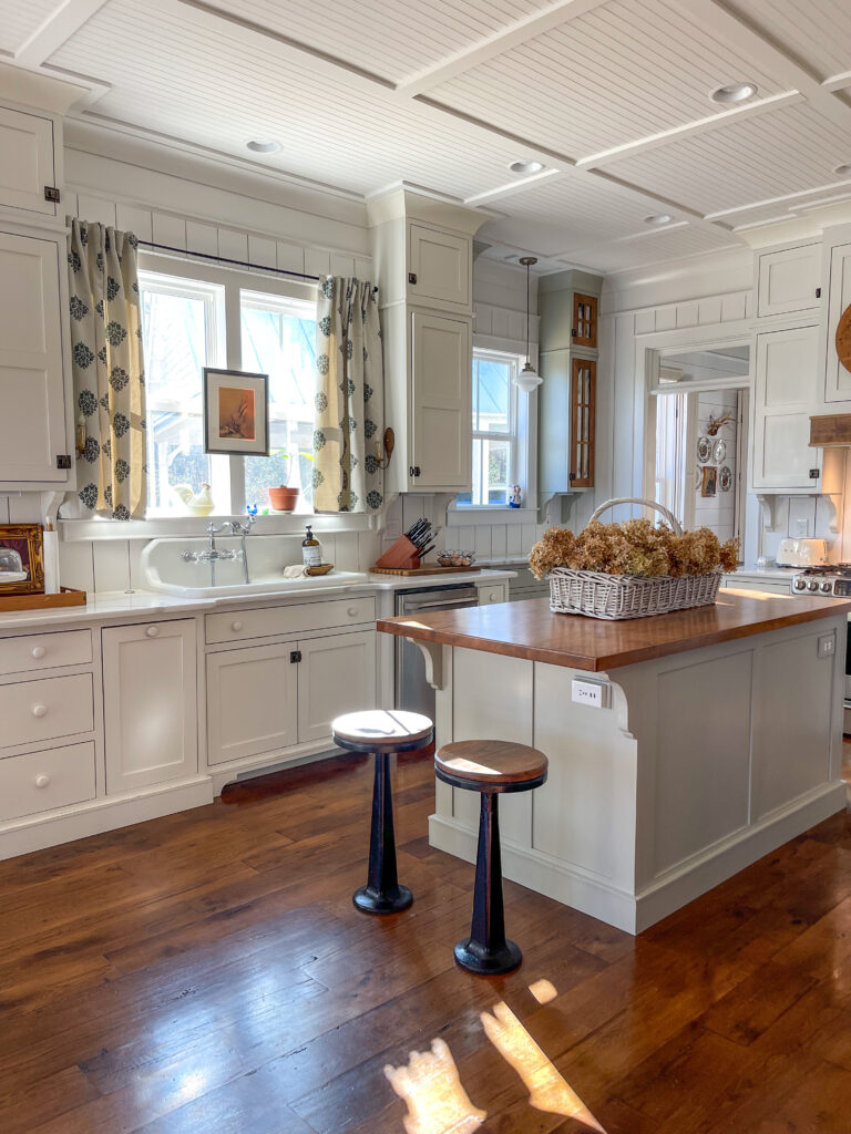
Thorn Cove Abode Dream Kitchen Design
My historically inspired dream kitchen is maybe my favorite thing about our home! I feel like it truly embodies a modern kitchen with tons of character. Initially, I was torn on whether or not to go “full blown” old kitchen because I love a good “unfitted” kitchen. Ultimately, I decided a modernized kitchen with fixed cabinetry was going to fit our family needs best. We entertain at our home a lot and I need all of the cabinetry for storage.
I don’t know if you knew this about me, but I often sketch out my design plans myself. Since our home is a new build, there was an original design that came with the plan. Of course, the kitchen in the original house plan wasn’t ideal for me. I had very special “historically inspired” pieces I had sourced, hoping for my “one day” dream kitchen, over the years. {You can read more about my hand drawn kitchen design here.}
Dream Kitchen Must Haves
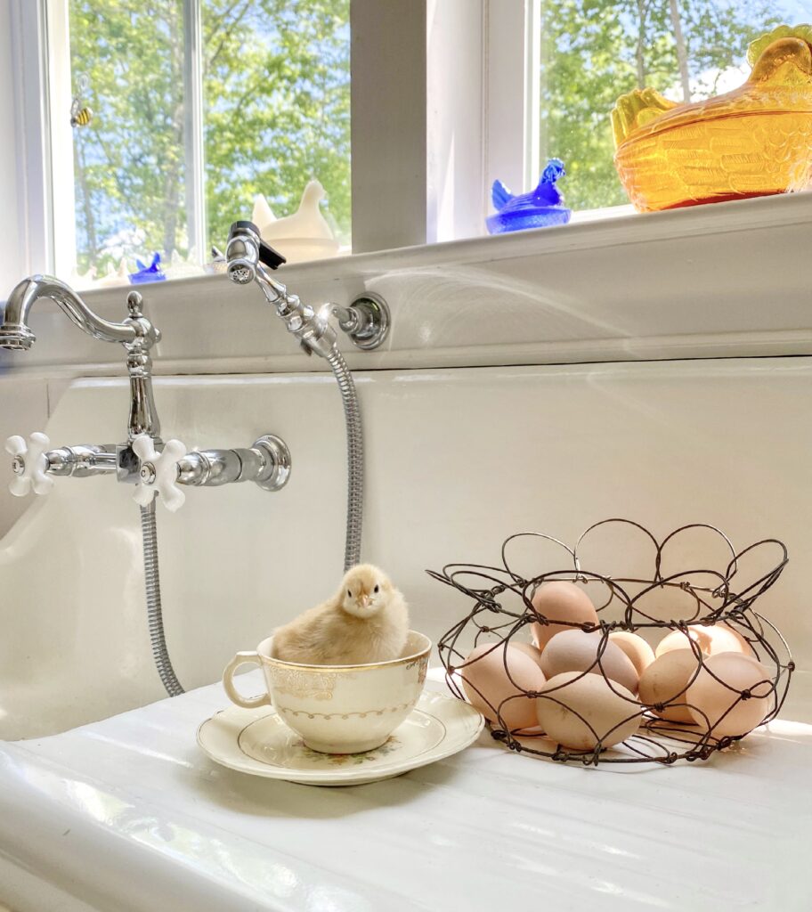
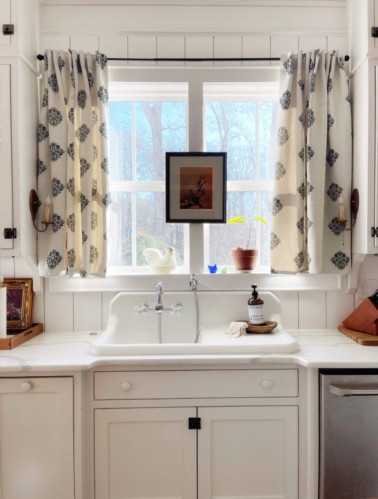
Before I started sketching out our kitchen, I wrote down my must-haves. I wanted my kitchen sink under a window because I had an old wall mounted cast iron sink that was a non-negotiable. {I also love this old double sink} I have a beautiful reproduction faucet and almost look forward to doing dishes… almost 🤪. This past Spring, I updated the curtains and although they are from Amazon, they look so high end. And don’t you love those sweet blue hens? Shouldn’t all kitchens have a little hen or rooster?
I HAD to have a pantry and a huge island for all the times we entertain with so much food. With those things in mind, I began sketching my kitchen keeping in mind the “working triangle”. The “triangle” represents your unblocked traffic flow between the stove, sink, and refrigerator.
Cabinet Choices
So, a new kitchen inspired by historically old southern kitchens was my real vision. Several elements were needed to accomplish the vision and the cabinetry choices were crucial. After looking and looking, I went with a simple shaker style with inset cabinet doors & drawers. The finishing elements are reproduction cabinet latches and painted wooden knobs. I love a painted wood knob– it is so classic on historic furniture!
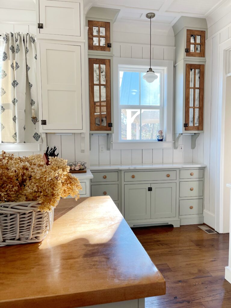
While making the decision to do inset cabinets I heard a lot about how after several years they would droop. After being in our home close to five years I am happy to report we have not had any issues. We chose really good solid maple wood for the doors.
The quality of the wood is so important when choosing to do inset cabinetry. Inset cabinetry is typically 10-25% more expensive than full overlay cabinets because they are crafted to fit perfectly inside the cabinet frame. While we did spend more, it was worth the extra expense because it is a huge part of the historic charm and vision I wanted to emulate. This is our forever home we hope to pass down for generations so a beautiful quality, classic kitchen was very important to me.
Shelving and Island Selections
At the time of building my home, open shelving was wildly popular. While I don’t mind the look, I think cabinetry is more practical for my family. I hide all my ugly dishes behind closed doors. Also, the dust your dishes collect on open shelving seems to be daunting! I chose to go to the ceiling with our cabinetry because I don’t really enjoy dusting (ha!) We use those hard to reach upper cabinets for seasonal decor for the kitchen. The extra storage space is nice to have and I don’t go up there more than a few times a year.
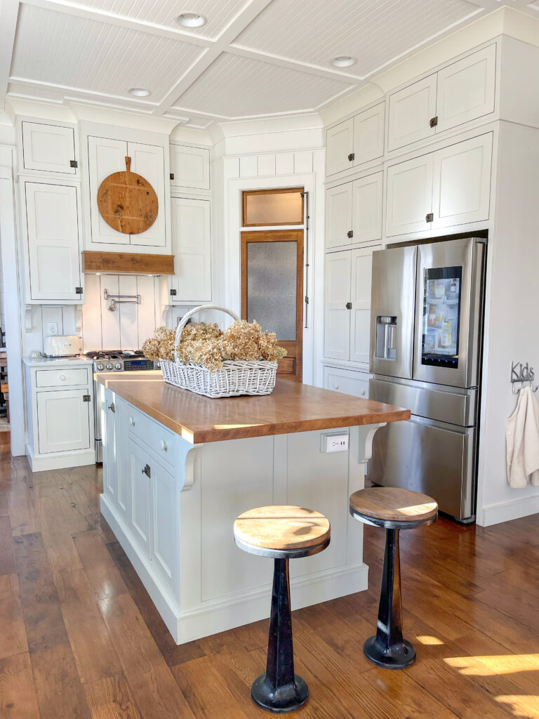
The kitchen island was something I went back and forth on in order to create the perfect size. I wanted it large enough for hosting and extra counter space to spread out since my design didn’t include long counter spaces. For the ideal island spacing you want a minimum of 36” between the edge of your island and any other cabinetry. Since I had enough floor space, I ended up going with 40” between the two.
An important thing to keep in mind when you’re planning is the spacing with your dishwasher and refrigerator doors open. You should also consider how many people you generally have in your kitchen while you’re in there cooking. At my house, there is always a “helper” in the kitchen with me so having just a few more inches allows for some passing space. Our island is completely custom fitted and measures 39”x79 1/2”.
Dream Kitchen Pantry
For me, a pantry is a non-negotiable. While I’d love a huge walk-in pantry, my space would not allow for that so I had to get creative. Truthfully, I wouldn’t have ever chose a corner pantry if I had options. However, it worked out and now I love that cute little corner pantry! It’s the perfect size for a family of four. I will say, it gets tricky when you entertain a lot and have entertainment pieces that you only want to pull out for special occasions stored in there. I ended up getting rid of a lot of my platters and special dishes for entertainment.
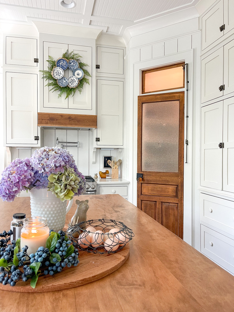
The size of the pantry is 46”x46” with a 24” door. The door is from a shop that is no longer in operation. I purchased it years ago before I ever knew I would be building a home and just stored it in hopes of “one day.” The door was only $60 and it is over 100 years old with original paint, patina & etched glass. Can you believe that? Fun fact: the door knob is real amber and was reused from my very old front doors!
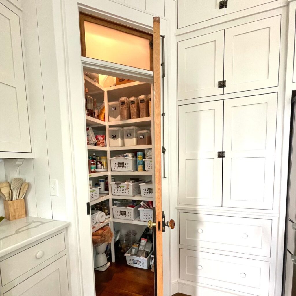
On the inside of the pantry (don’t look too closely-we friends, right?) we built floor to ceiling shelves and made sure to leave some shelves with more height for cereal boxes and pasta storage (pro tip there!) I store small appliances on the very top shelf and my entertaining pieces on the floor in baskets. In the end, having a smaller pantry forces me to keep it tidy because I need every square inch to be efficient.
Finishing Selections
If you are a historic home lover like myself, you’ve noticed the lost art of millwork in newer construction homes. Stunning millwork was essential to adding the historic charm to our new build. If you need a little more info:
“Millwork is woodwork fabricated in a mill. The term refers to any number of products, from doors and panels to moldings and trims. Essentially, decorative construction material that is built into a home that is non-structural.”
For our home choices, you’ll see on the walls I have pine tongue and groove all the way around. Yes, even behind the stove and no, it has never been an issue to keep clean or maintain! I just wipe it down as I do any other surface in my kitchen.
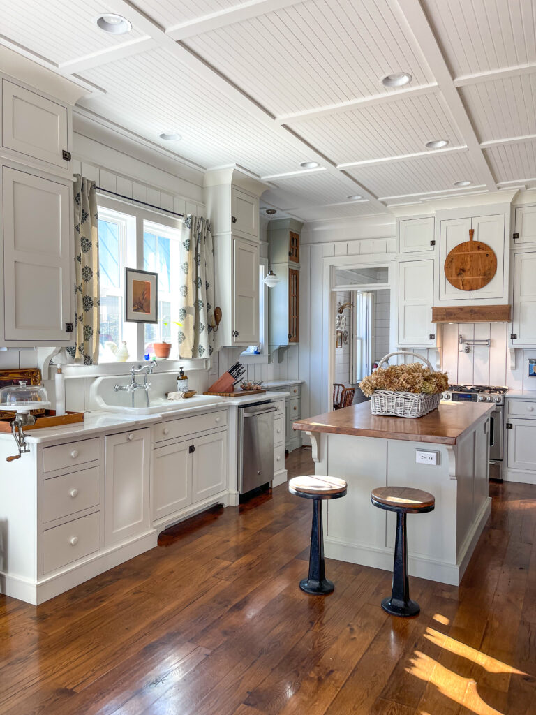
For the trim, I went with 6” alcove molding with 2” portrait railing just below which is another nod to the historic homes that I love. Portrait railing is found in older homes where the walls were made of plaster. Hanging a nail on a plaster wall can cause it to crumble. People would literally use the picture rail to hang art and portraits in order to protect the walls.
The ceilings are sheets of bead board. We chose to save quite a bit of money here by going with the sheets rather than the real deal, which I think turned out just as nice. We covered the seams of the sheets with 1×4 boards and then of course painted them.
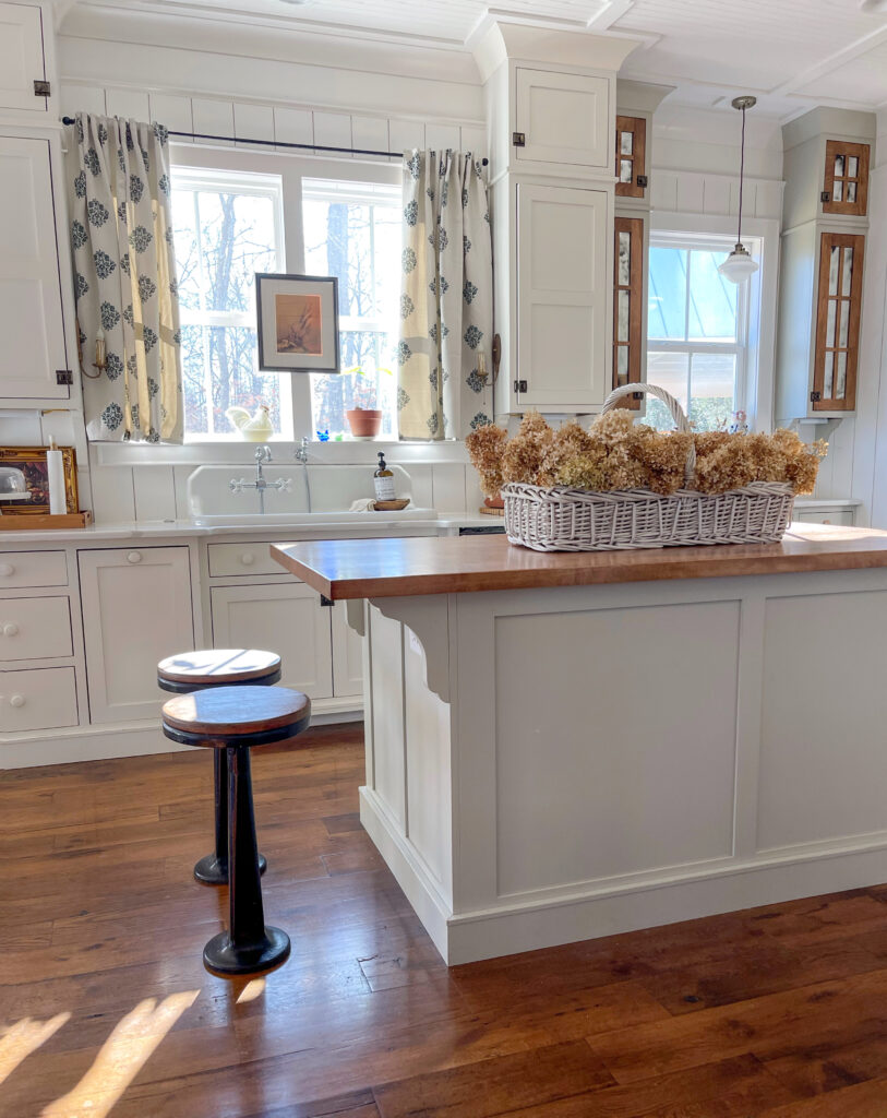
Soda Fountain Stools
With historic inspiration at the forefront of my mind, I knew I didn’t want just any ol’ stools for our island. I wanted something unique and original. When I ran across these antique soda fountain stools at a local antique mall, I knew they would be perfect!
The stools are actually bolted to the floor so we had to measure perfectly before installing. Ensuring everyone would have enough legroom while still being comfortably close to the island top for eating was important. I absolutely love the charm they add to my historically inspired kitchen. I had never seen anyone use anything like this in their home before. They turned out even better than I envisioned.
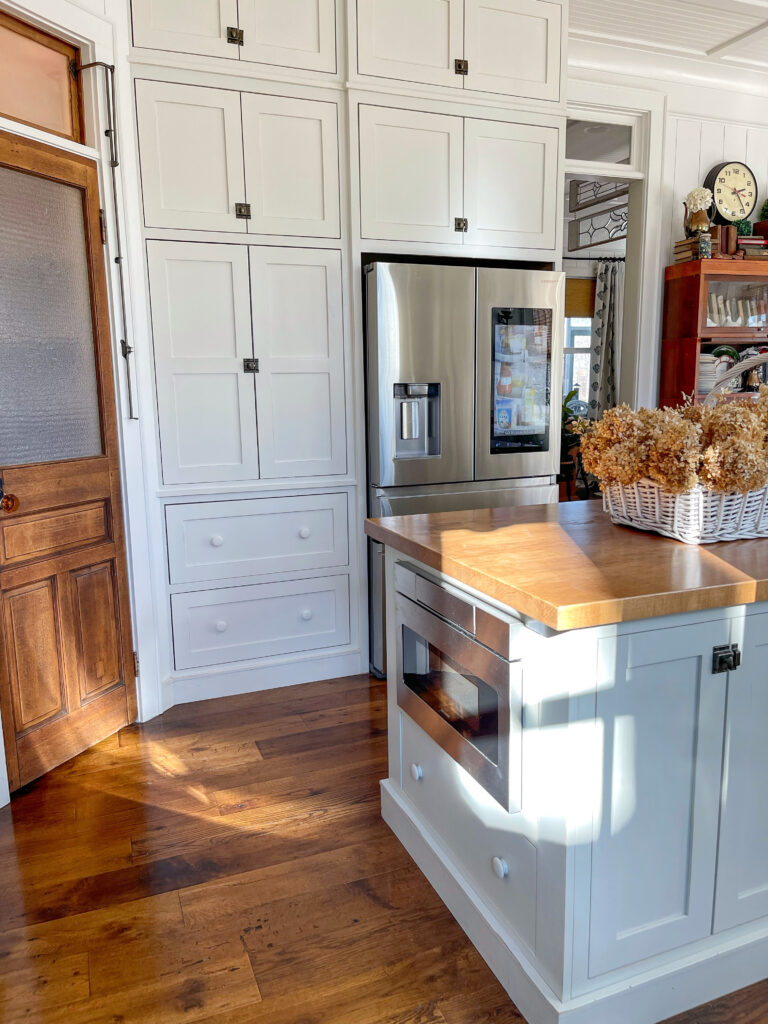
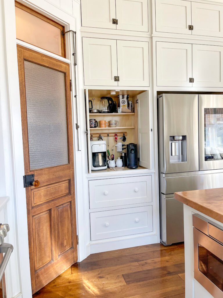
Coffee Bar
The coffee bar is probably my favorite little nook in the kitchen. If you recall, I updated it earlier this year as it had became a storage spot for office supplies. Since we both love coffee we had to get it back to what it was initially intended for. Side note: Mark became an absolute coffee snob last year and you can read all about that here.
We are fully stocked with a Stanley Stay-hot French Press, an Electric Kettle and Drip Coffee Maker. And of course my beloved Nespresso too! And we’re able to hide everything behind the pretty cabinets – even better!
Dream Kitchen Color Palette
I get asked all the time about colors, especially the shade of white. The colors we used in the kitchen are Sherwin Williams Snowbound on the walls, Sherwin Williams Techno Gray on the island and Butler’s Pantry and then Sherwin Williams Ivory Lace for perimeter cabinetry. On the range hood and butcher block, we had a stain custom mixed by my cabinet maker to match the original wood on my old pantry door.
The countertops are Quartz in the color Calacatta Vintage. The sconces by the sink were found at an antique mall. I had them rewired and just love what they add to the space!
If you haven’t noticed, there are a ton of windows and very little wall space in the main areas. So, one of my favorite ways to change up the kitchen seasonally is to change out the artwork above the stove on the range hood. Since the cabinetry above the stove is actually faux, I just use a nail to hang things.
If you are looking for more of my favorite kitchen items, be sure to click the “Shop My Home” section of my blog!
I would love to know, what do you love most about my historically inspired kitchen? I will tell you what I love! The views of the lake from the kitchen is my real favorite. I also love how functional everything is. I love that the breakfast nook is right off the kitchen. And I love how historically inspired my dream kitchen really is!

I was wondering what you used for the island counter top? This definitely doesn’t look like butcher block. Is this a sold slab of maple? Is it sealed with poly?
I love the coffee bar and soda fountain stools!
Your kitchen is beautiful!
Thank you!!
I have always loved your kitchen. One of my favorites! It feels like home!
I’m considering building this same house plan next year and I LOVE how you modified this kitchen. It’s beautiful!
If you could go back and build again, is there anything you would do differently?
THank you. I wouldn’t change anything about the kitchen… I spent countless hours making sketching it to what I wanted it to be.